» OUR COLOURS FIT INTO
ENVIRONMENTS OF
EVERY CONTRAST«
Do you have a personal favourite amongst the
GROHE finishes?
Yes, the Brushed Hard Graphite. Which is, by the way,
the most sophisticated finish we have right now. I’m
in the process of redoing my kitchen all black on black
and I’m going with that finish.
What are the rules for choosing finishes for the
bathroom?
To be honest, there are none. I think we’re in a day and
age where designers are much more free to do what they
want. With our opened up colour and finish options
in this collection, we’ve given them no rules. There are
just endless possibilities to work with here. If I had to
suggest one rule, it would be to coordinate the finishes.
Because there’s nothing worse than going into a space
and having a different colour faucet, a different colour
shower, a different colour towel holder. And with GROHE
SPA Colours you get the full coordination of whatever
colour and finish you need.
What can you tell us about the interactions of
shapes, surfaces and finishes?
The way we’ve articulated this design range to the design
world is: you have three types of environment. You have
high-contrast environments and you have tone-on-tone
environments. And in the middle you have mid-tones.
Let’s say I was designing an all-black bathroom. I have
more or less some options. But if I wanted black tile on
the wall, I could pick the opposite of it, which would be
chrome to give it a more contrary contrast finish. Or if
I wanted the whole bathroom to be a soft matt finish,
I can use the brushed surface. So in terms of the
interactions of shapes and surfaces, it all depends on
what the interior design strategy is. But that’s why
we’ve offered a polished and a brushed finish to give
you that flexibility in your interactions. And this rings
true for all colours, available in polished or brushed.
Can you give us an example?
When I say the word vintage you think of the brushed
gold, but when I say luxury you think of the polished
gold. It’s the same colour, it’s just a finish difference.
By just changing the finish, I can give you a different
verbal cue of vintage vs. luxury. The reason we have a
brushed and a polished is to allow the ultimate flexibility
between the interior strategies.
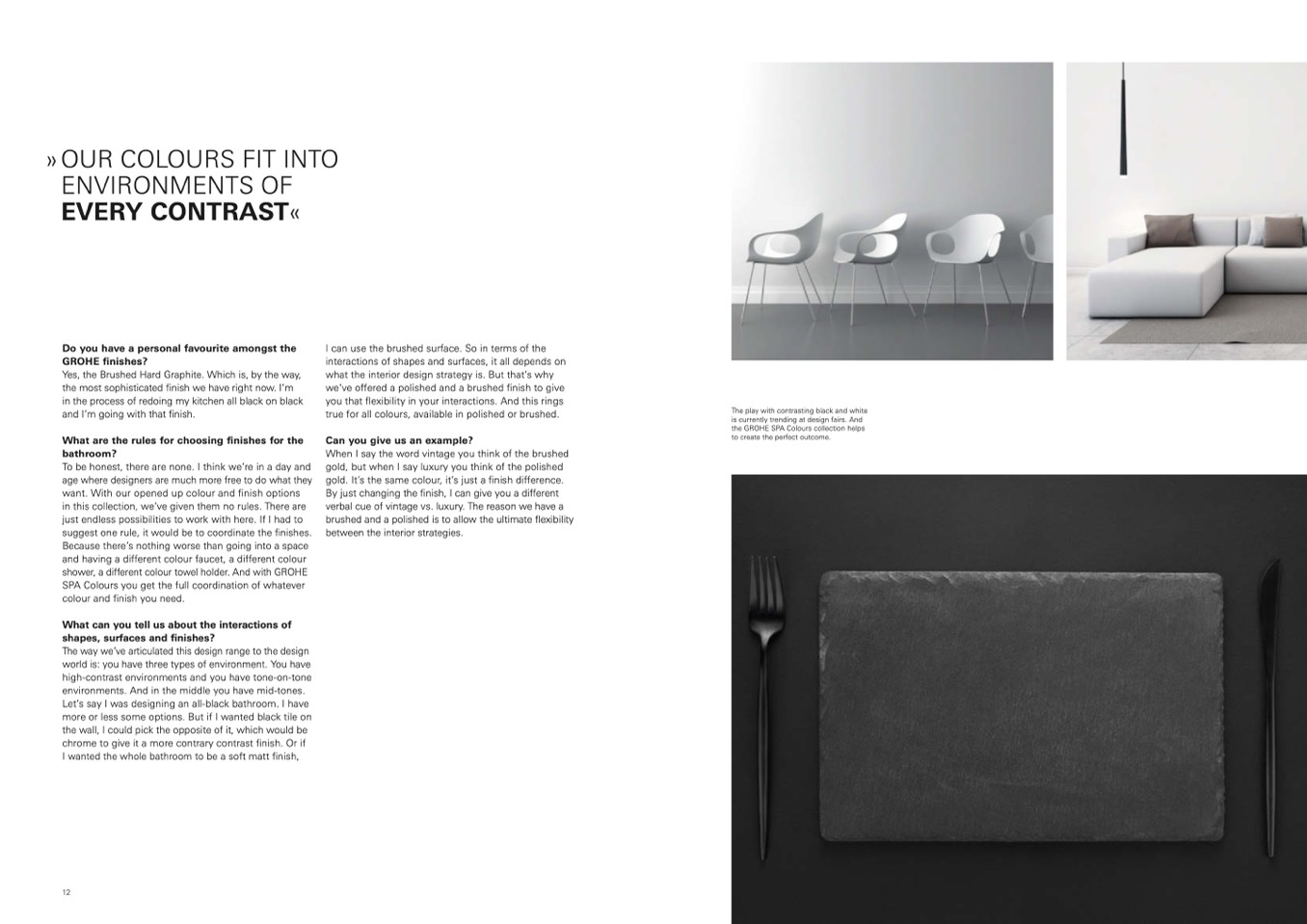
The play with contrasting black and white
is currently trending at design fairs. And
the GROHE SPA Colours collection helps
to create the perfect outcome.
12

